Optavia.com site redesign
Brand and eCommerce Website
Research | Personas Creation | Site Architecture | Wireframe | Prototype | User Testing | Experience | Visual Design
Overview
The former brand is Take Shape For Life, with little to no brand awareness and brand positioning. In 2017, this brand transforms to OPTAVIA with concise brand narrative, positioning and a mission to expand and become a well-known brand in health and wellness globally.
The Challenge
- The former brand is lacking awareness and positioning.
- Our distributors feel that the current site is very transactional, and does not tell the story
- Our distributors are afraid of losing the lead if the prospects were to use “Find A Coach” functionality because the current site does not have email validation in place.
- There's a limitation in a current eCommerce platform which prohibits the ability to redesign the entire product catalog and check out experience.
The Insights
Based on the user research through personal interviews with top distributors, the following are their pain-points around the existing eCommerce and their personal website experience:
- Current branding does not represent who they are and what they have to offer
- There’s no compelling story for customer attraction
- There's a lot of information that is too overwhelming, don’t know what program to choose
- Afraid of losing lead through Find A Coach Functionality
- The shopping experience is a bit overwhelming, customers don’t know what products are right for them and what to choose
- Prefer one page check out, with PayPal as a payment option
- Too much emphasize on Business Opportunity, make the company look too much like other multi-level marketing
- There're couple distributors who are healthcare professionals, they need a webpage that speaks to that demographic rather than mass population so they can use as a recruiting tool.
The Process
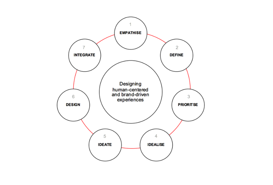
Using Design thinking, I’m partnered with our branding agency, top-level distributors along with couple key internal team members to design the new desirable web experience and follow the key steps of human-centric and brand-driven experiences.

During the ideation stage, we came up with the idea for the distributor personal website home page to have each distributor tell their story in a video format as part of their user-generated content. Due to the legal constraint around making sure the video content is in compliant with FTC for weight loss claim, our legal department did not approve that idea. We ends-up with before and after pictures that user upload with corporate control disclaimer at the bottom, a user-generated write-up story that will go through a content approval process before appearing on the website.
Personas

Information Architecture
Tools: OminiGraffle
Utilizing card sorting with selected users group, and getting feedback from stakeholders to come up with main navigation pages and subpages. Because we are not changing the product catalog and check out experience due to current platform limitation, I did not create a detail flowchart for the shopping experience since this has alreday existed. I use Omni Graffle to create sitemap flowchart.

Wireframe
Tools: Axure, Sketch

Design Prototype
Tools: Sketch, Invision
Usability Testing
We conducted usability tests through the development of our wireframe and prototypes and integrated the following changes based on the feedback we received:
- Change some of the main navigation labels to make it shorter and more straightforward. Change "Start your Journey" to "Products ↦ Program", "Join our Mission" to "Join Us", "Shop our Store" to "Shop"
- Remove "Career Opportunity" section out of the main navigation, our users feel that this section is distracting to prospects and clients whose main goal is to find a weight loss program and not a business opportunity. They feel it is too early to introduce a business opportunity and should not be part of the main navigation
- Homepage, remove a selection for starting a business as a health coach out of the main content selector, keep the focus on finding a weight loss program and get started
- On the personal website of distributors, we remove Direct Selling Association page out of the sub-navigation on the about us section, just have it visible at the footer level.
The Result
A responsive site with main features and functionalities that address our user pain-points.


Future Considerations
- Redesign the entire product catalog and check out experience when changing the e-commerce platform.
- Ability to have multiple autoship program
