OptaviaConnect.com
Back Office Web Application for Distributor
Research | Personas Creation | Site Architecture | Wireframe | Prototype | Experience Design | Visual Design
Overview
The former back office web application is very outdated and not user-friendly. It is a 10 years old system, it is not a stable and scalable system. In order for the company to support future growth, there's a need to replace the current application with a new platform along with update the new branding.
The Challenge
- Users find current application not intuitive and very complicated to use
- The company do not have in-house resources to support current web application
- The current application is not stable and not scalable for future growth
- With the rebranding, there's a need to update the application to reflect the new brand
The Insights
Based on the user research through personal interviews with top leaders, the following are their pain-points of the former back office web application experience:
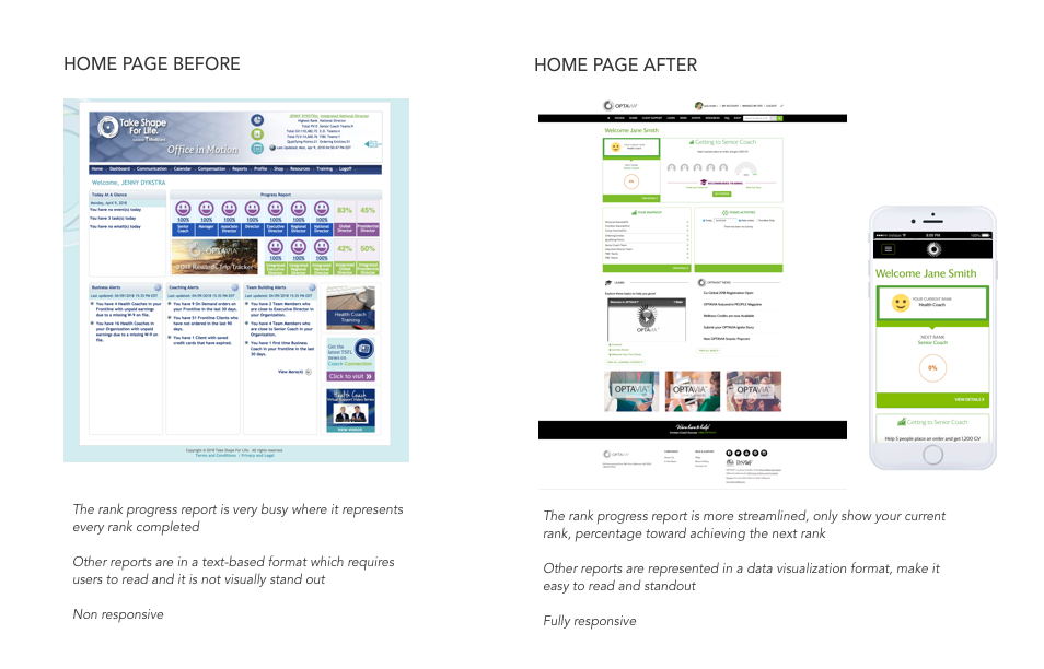
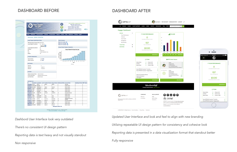
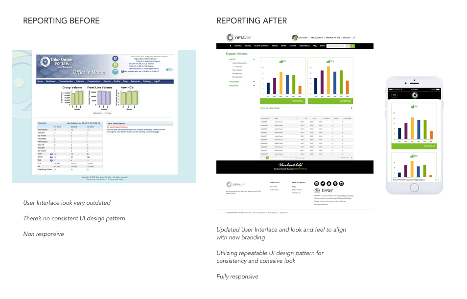
- It looks very outdated
- It is very difficult and time-consuming to run a report because there's no filtering or sorting functionality
- Report data is being presented in a text-based format, which is not intuitive and not standout
- Digital and video assets for training purpose are not easily accessible and sharable
The Process
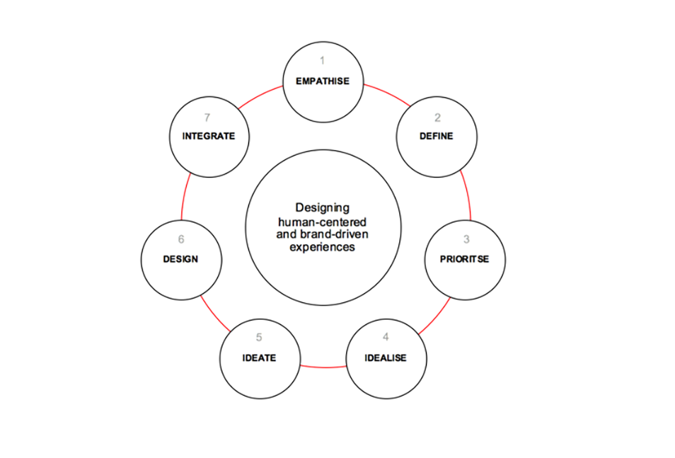
Using Design thinking, I’m partnered with our branding agency, top-level distributors along with couple key internal team members to design the new desirable web experience and follow the key steps of human-centric and brand-driven experiences.
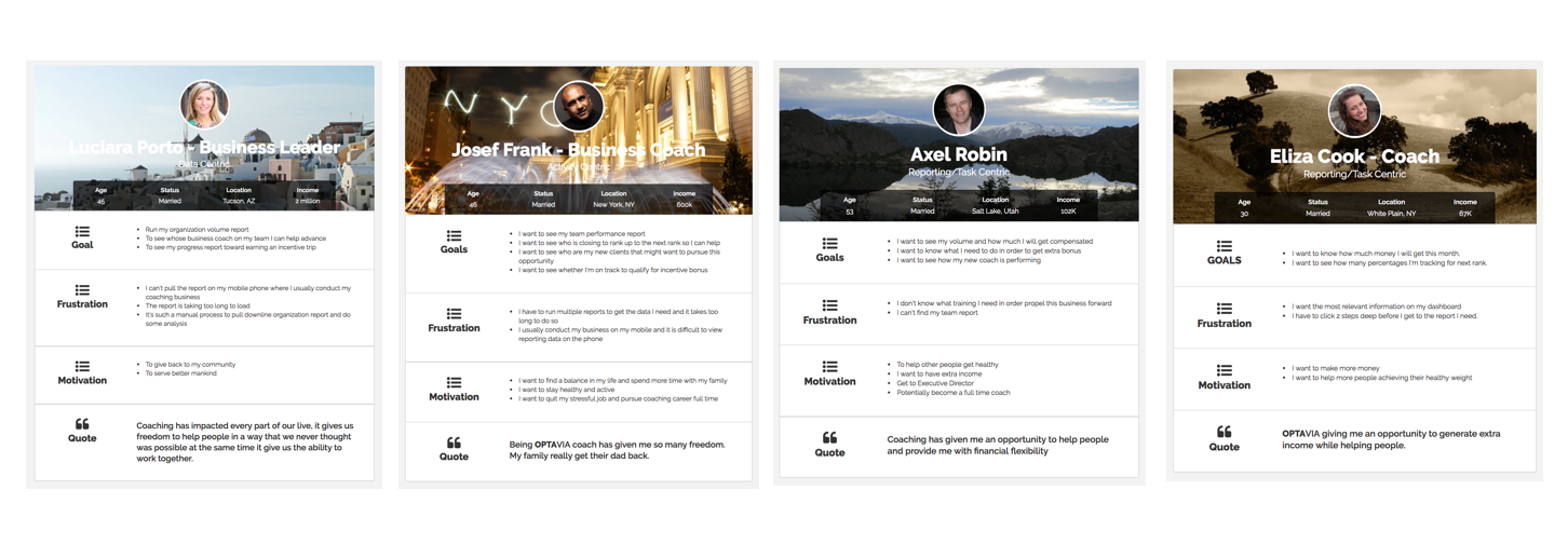
Personas
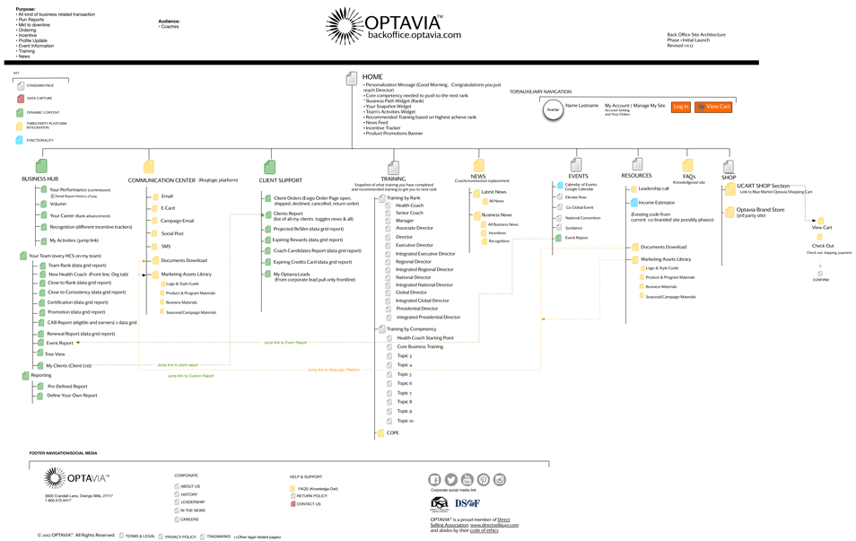
Information Architecture
Tools: OminiGraffle
Utilizing card sorting with selected users group, and getting feedback from top-level distributor to come up with main navigation pages and subpages. I use Omni Graffle to create sitemap flowchart.
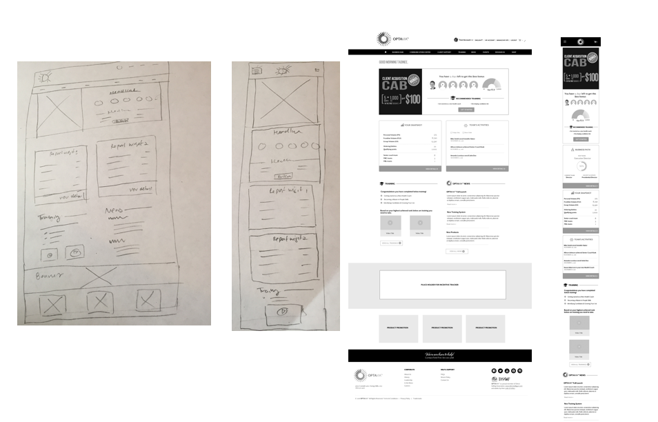
Wireframe
Tools: Axure, Sketch
Design Prototype
Tools: Invision
Usability Testing
We conducted usability tests through the development of our wireframe and prototypes and integrated the following changes based on the feedback we received:
- Add search by name or ID with an option choose a specific account type for quick reporting results
- Rearrange the order of widgets on client report page based on users most important use case
- Add event registration reporting feature so distributors can use that report to engage and encourage their team who have not yet registered for the event to register
- Add corporate driven events in calendar section for quick reference
The Result
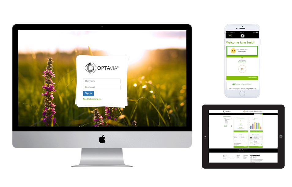
A responsive web application with improved reporting functionality that address our user pain-points.
Future Considerations
Based on site usage analytic data and on-going feedback from the users, below are some consideration for improvement:
- Remove "News & Updates" content from dashboard page
- Improve mobile experience by adjusting left navigation on sub pages to be part of the main navigation
